Charts
and Graphs
Reveal hidden trends using our all-new charts and graphs feature. You can stare at a long report all day long and not have the insights that a graph can reveal instantly. Our graphing program offers five different general categories of graphs, all of which can be used in a myriad of different ways.
Item
History
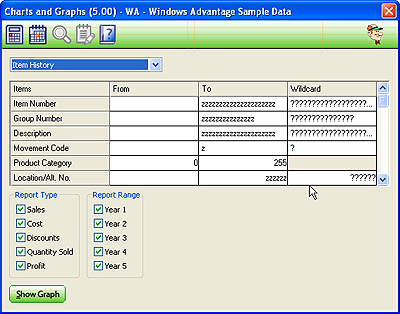
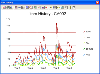
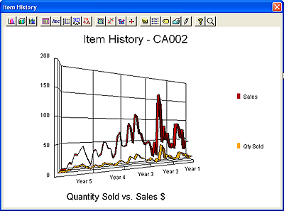
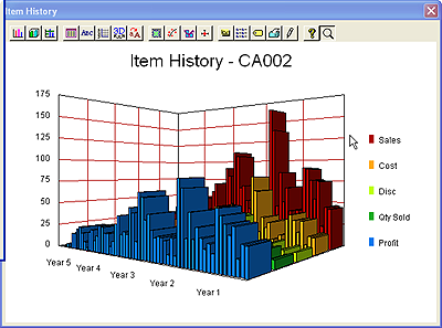
Produce graphs showing the sales history of your items. You can graph
any or all of your five years of monthly sales history, include any
combination of sales dollars, costs, discounts, quantity sold, and
profitability figures, and choose ranges of items. You can produce a
graph for a single item, a product category, a range of groups, items
at a certain price level ... the opportunities are endless! Here's the
program screen and some sample graphs from this option:
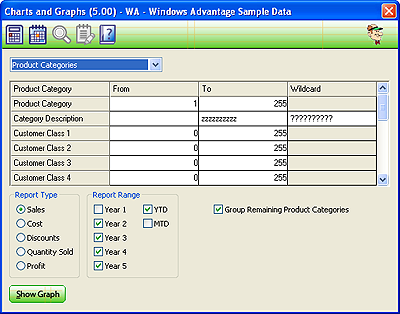
Product
Categories
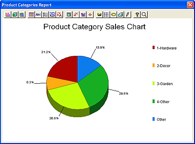
A pie chart of your product category sales is perhaps the simplest and
most effective way to pinpoint the weakest and strongest aspects of
your business. Your pie charts can graph sales dollars, cost,
discounts, quantity sold or profit margin, and consider figures from
any combinations of your month-to-date, year-to-date, and 5 years of
history.
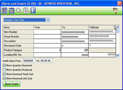
Receipts/Productions Over Time
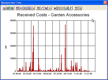
Are your receiving costs on the rise? Just how much is it costing you
to restock your inventory, and should you change your strategies? If
you do in-house assembly/production work, is your productivity rising
or falling? These are just a few of the many questions you can answer
with this graphing option.
This option allows you to chart quantity received, total receipt costs
and/or unit receipt costs over time. It can also show the same graph
style for productions quantities. These graphs can be generated for
practically any combination of items, from a single item to your entire
inventory.
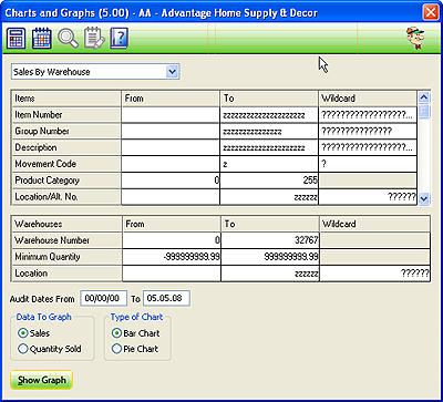
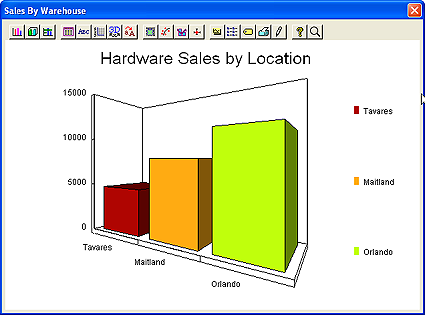
Sales By Location
If your business has multiple locations it is important to judge each
location's strengths and weaknesses. Our warehouse graphing function
gives you the ability to compare your locations (warehouses) to make
informed management decisions. You can graph any combination of items
and warehouses, and graph sales or quantities sold.
Inventory Turns
One of the most powerful metrics that you can examine for your business
is inventory turnover. Profitability, sales and costs are important,
but you can make your business succeed or fail simply on how well you
manage your stock. The inventory turnover graphs can do wonders for the
profitability of your business.
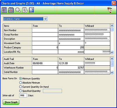
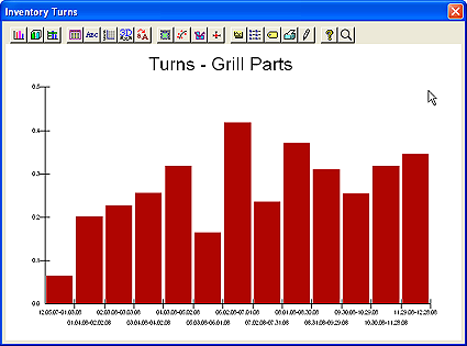
The Turns graphing option allows you to choose any combination of
items, warehouses and serial numbers to include on the graph. Since
this is, by default, a bar graph it allows you to choose the number of
days to be represented by each bar. And most importantly, since
calculating turnover is dependent on your base inventory level,
the program allows you to choose from a wide range of options for
determining that value.
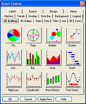
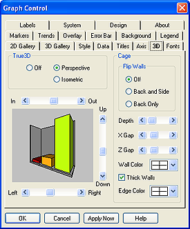
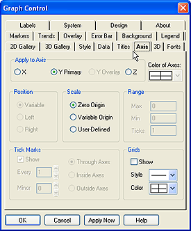
That's all for the Charts & Graphs program, but here are a few
screenshots of the customization options available when graphing.
You'll be amazed at just how flexible the system is -- don't graph your
data our way, do it any way you want it!
Roundtable Software Home | Add-On
Products | Custom Programming | Support Services | Power Utilities | Partners | What's New
| Site Map
|
|
|
 |
|
|
Roundtable Software • 30831 Cove Road • Tavares, FL
32778-5164
(352) 253-9779 • FAX: (815) 572-5446
All contents
copyright © 2000-2008 Roundtable Software. All rights reserved.
|
|
|
|
|
|
|
|


